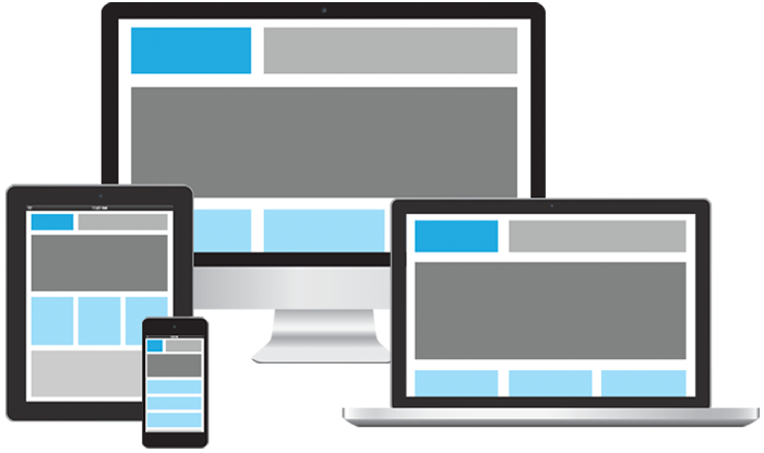
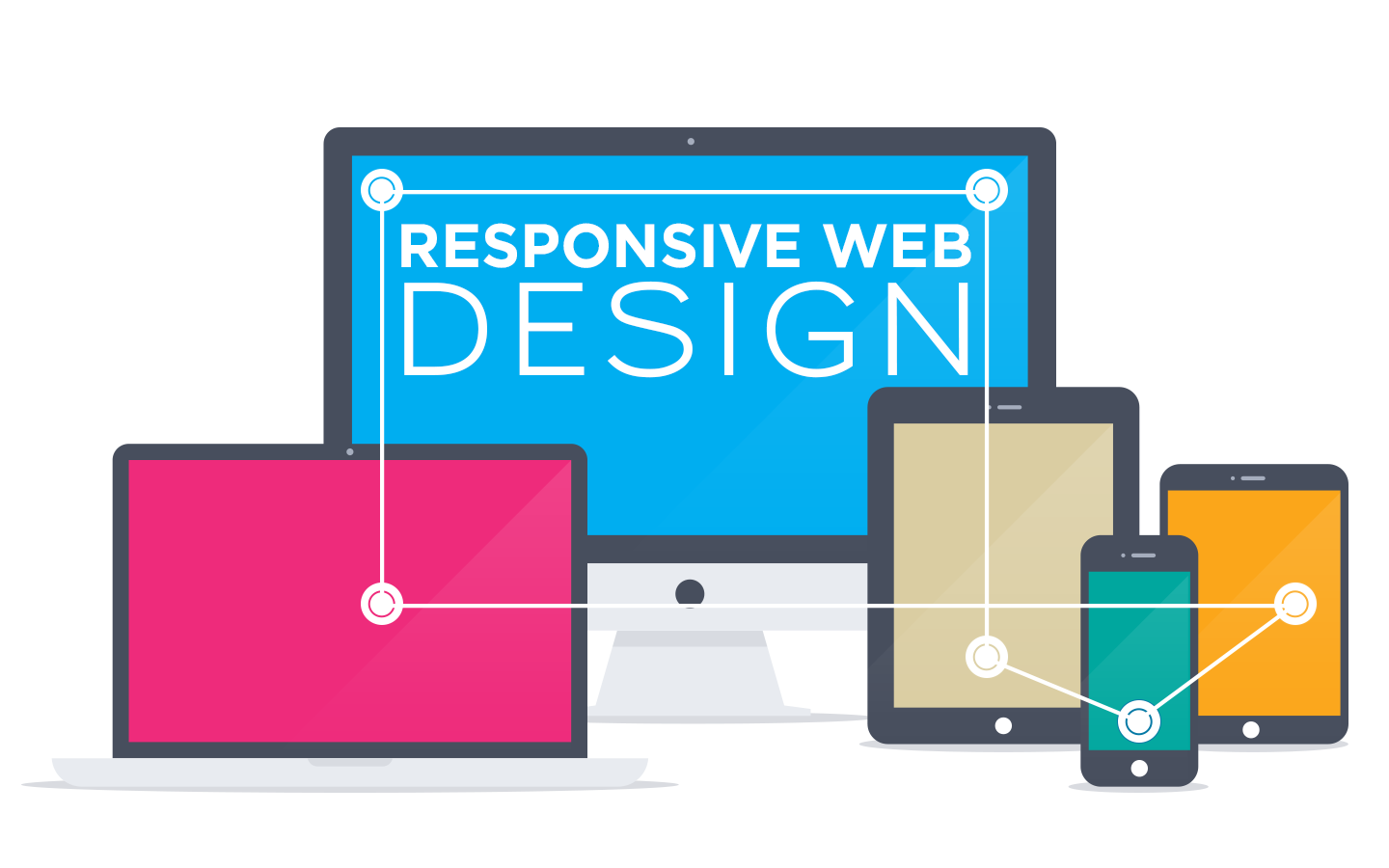
Responsive web design allows one to use technology and methodology that develops a website that will automatically adjust to the screen size and device when interchanged from one device to another. This system of developing and designing a website that is dynamic for all devices thus ensures a consistent user experience, allows replication of content on large or small screens. The user's experience is kept in mind and is adjusted based on what the user is using to see your site or page.
They say...mobile is the future. Every product or service that are promoted on various channels, needs to be migrated to a mobile platform. It is evident that mobile devices with full browsers have far greater reach than any other platform, considering there have been more Google search queries on smartphones than on desktop computers and tablets. So why not embrace this change?
At Digital-Art we believe in perfection. This has made us one of the leading website designing company in Mumbai with worldwide network. For us a website is just not only a source of information, but also a strong marketing tool for your business.

305, 3rd Floor Creative Industrial State, Sundar Nagar Road Kalina,
Santacruz (E), Mumbai 400098


+91-9137124341 / +91-9821314600
Mon-Sat 9:30am - 5:30pm